|
|
|
|
This Tutorial is available as a PDF document(pdf/zip/gz)
and in HTML form(see below/zip/gz)
respectively.
|
Zaval Light-Weight Visual Components Library
Version 3.0
Tutorial
Zaval Creative Engineering Group
http://www.zaval.org
Contents
Introduction to the Zaval Light-Weight Visual Components Library.
Is it difficult to use the library?
Architecture.
Deploying lightweight library.
Lightweight library packages.
Deploying steps.
Lightweight properties file format.
Lightweight Component.
Abstraction.
Lightweight component.
Lightweight container.
Lightweight painting.
Lightweight view management.
Lightweight events conception.
Lightweight validation.
Lightweight static objects.
Lightweight scrolling.
Lightweight applications
Support available.
Stay informed!
Zaval Light-Weight Visual Components Library (LwVCL) is a pure Java alternative to humble AWT-based GUI interfaces for wide ranges of platforms such as PersonalJava and J2SE.
Designed as light-weight but built separately from AWT (not on top of the java.awt library like Swing), the LwVCL is the good alternative to highly performant, memory-efficient, flexible GUI solution for embedded, stand-alone and applet applications.
LwVCL can be used on wide range of PersonalJava compatible devices, including iPAQ, Zaurus and top models of mobile phones with the same API as it is used in J2SE application; our library is most efficient way to develop highly scalable GUI applications from PersonalJava to any J2SE applications.
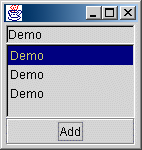
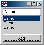
The best way to demonstrate the library usage is a good sample. The table below shows very simple examples that have been created using the lightweight library (left column) components and Java AWT components (right column).
In this sample user can add (using button "Add") content of a text field to the list.
| Lightweight sample code |
AWT Sample code |
import org.zaval.lw.*;
import org.zaval.lw.event.*;

public class LwDemo
implements LwActionListener
{
  static LwList list
       = new LwList();
  static LwTextField text
       = new LwTextField("Demo", 10);

   public static void main(String[] args)
   {
     LwFrame frame = new LwFrame();
     frame.setSize(200, 200);
     LwContainer root = frame.getRoot();
     root.setLwLayout(new LwGridLayout(3,1));
     LwButton button = new LwButton("Add");
     button.addActionListener(new LwDemo());
     root.add(text);
     root.add(list);
     list.setPSSize(100, 70);
     list.getViewMan(true).setBorder(
                     new LwBorder(2));
     root.add(button);
     frame.show();
   }

   public void actionPerformed(LwActionEvent e)
   {
     list.add(new LwLabel(text.getText()));
   }
}
|
import java.awt.*;
import java.awt.event.*;

public class AwtDemo
implements ActionListener
{
  static List       list
     = new List();
  static TextField  text
     = new TextField("Demo", 10);

  public static void main(String[] args)
  {
    Frame frame = new Frame();
    frame.setSize(200, 200);
    frame.setLayout(
      new FlowLayout(FlowLayout.LEFT)
      );
    Panel pan = new Panel();
    pan.setLayout(new BorderLayout());
    Button button = new Button("Add");
    button.addActionListener(new AwtDemo());
    pan.add(BorderLayout.SOUTH, button);
    pan.add(BorderLayout.CENTER, list);
    pan.add(BorderLayout.NORTH, text);
    frame.add(pan);
    frame.show();
  }

  public void actionPerformed(ActionEvent e)
  {
    list.addItem(text.getText());
  }
}
|
| Lightweight demo application |
AWT demo application |
 |
 |
These two examples are practically the same, so there are no problems for Java AWT programmers to use the Zaval Light-Weight Visual Components Library. Take care that even the simple example shows some powerful features of the library:
- The lightweight list component uses other components as list items, but the AWT list component can have only strings as item.
- The lightweight component provides setPSSize(int, int) method to control preferred size, but AWT component has fixed preferred size, so it is impossible to control preferred size of the Java AWT components.
- The lightweight component provides special view manager to customize the component view. In this example the view manager is used to set border view for the list component.
The core idea is to reject java.awt.Component inheritance. The library provides LwComponent interface that is basic for all components of the library, instead of java.awt.Component. The library architecture is shown below.
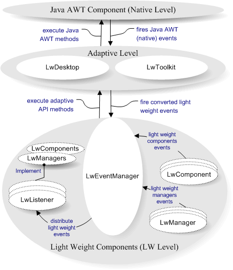
The lightweight library has three levels:
- Level 0 (Native). This is Java AWT area. In common case the level represents a Java UI implementation. As rule this level provides java.awt.Graphics, java.awt.Image, java.awt.Canvas or their analogues. Actually it is enough for Adaptive level to be easy implemented.
- Level 1 (Adapting). This level adapts native events to appropriate lightweight events, provides ability to work with graphical context and has a set of native-specific methods that are necessary for the library. LwDesktop adaptive class is responsible for native events conversion process and it provides set of methods to work with a graphical context. LwToolkit adaptive class provides set of native-dependent methods. This level is very important to use the library on other systems that have their own Java UI implementations (for example portable devices). To adapt the library it is necessary to re-implement the level classes and you shouldn't touch lightweight components set.
- Level 2 (Light Weight). This is a core level. This level provides all classes and components that are necessary to develop your own systems and components based on the lightweight library.
Level can be divided as follows:
- Lightweight components. This is set of widespread GUI components that are ready to be used. The list of the components is shown in the table below:
| GUI Component |
Short Description |
| LwCanvas |
This component implements LwComponent interface and should be used as the base for development own lightweight components. This is something like java.awt.Canvas component. |
| LwPanel |
This component implements LwContainer interface and should be used as the base for development own lightweight container. This is something like java.awt.Panel component. |
| LwLabel |
This component is used to show text messages (including multiline text). |
| LwButton |
The button component that can use images, labels and other lightweight components as a caption. |
| LwCheckbox |
Checkbox component. The component is used to organize radio group, checkboxes. |
| LwBorderPanel |
The border panel is used as decorative panel that can have other component as a title. The title can have following alignment: top, bottom, left, right, center. |
| LwLink |
The text link component. It is like a text html link. |
| LwImage |
This component is used as a canvas to show images ("gif" and "jpg"). |
| LwStButton |
This is a toolbar button component. |
| LwList |
This is a list component. The component uses other components as list items and can be used with different layouts that implement special interface (for example list and grid layouts). Starting from version 1.1 the component provides navigation possibilities:
- PG_UP, PG_DOWN to scroll page up, page down.
- Ctrl + Home, Ctrl + End to go to the first and last list items.
|
| LwCombo |
This is a combo box component. The component can use other components as list items. |
| LwTextField |
This is a text field component. The component can be used to enter single line text, multilane text, fixed size text, password text. Starting from version 1.1 the component provides block operations (it is possible to select and put data into clipboard, get and insert clipboard text).
- PG_UP, PG_DOWN to scroll page up, page down.
- Ctrl + Home, Ctrl + End to go to the first and last position of the text.
- Ctrl + Ins, Shift + Ins to put and get the selected text to/from clipboard.
- Ctrl + Left, Ctrl + Right to go to the previous or next word in the text.
|
| LwSplitPan |
This is a splitter panel component. It can be used to split two components and place the components inside sizeable areas. The splitter can have horizontal or vertical alignment. |
| LwNotebook |
This is a notebook component. It supports different alignment for notebook tabs (top, bottom, left, right). |
| LwScrollPan |
This is scroll panel. The component can be used to organize scrolling for any lightweight component. |
| LwScroll |
This is scroll bar component. The scroll bar can have horizontal or vertical orientation. |
| LwTree |
This is tree view component that can be use to render and navigate along tree-type structure. |
| LwStatusBar |
This component can be used to organize status bar panel that consists of other lightweight components. |
| LwProgress |
The component can be used to show progress status for some actions. |
| LwGrid |
The component is powerful grid component to render matrix data model. The component has been designed basing on MVC model. It is possible to customize cell rendering, cell editing processes. |
The light weight extra package components
(This package is delivered as a separated product) |
| LwTreeGrid |
The component bases on LwGrid component functionality and is used to render two bound data model: tree data model and matrix data model. |
| LwSpin |
The spin component allows input bound integer value. |
| LwMaskTextField |
This component is text field that allows input according to a mask. It is possible to use letter, numeric, date mask. The component provides set of classes to implement own mask handlers quickly. |
| LwWindow |
This component is supposed to be used as internal frame. |
- Lightweight managers. The LwEventManager is the basic manager for the library. The manager defines message delivering strategy and should be defined for the library. Another important manager is a paint manager. The manager is used with the lightweight component implementation to paint itself. The managers can be listeners for different lightweight events. For example, focus manager should listen mouse event to pass focus between components. The managers are initialized with lightweight manager (LwManager). Any managers can be overwritten by anybody. The manager deployment concept is powerful and easy to use - (See chapter - Deploying Lightweight library). The table below shows set of managers that is implemented and used with the library.
| Lightweight Manager |
Short Description |
| LwEventManager |
This is a core manager for the level. The manager connects the Level 2 with the Level 1. The main purpose of the manager is to determine event delivery strategy. All lightweight events are passed to the manager and only the manager can distribute the event according event distribution strategy. Lightweight events can be performed with components, other lightweight managers and Level 1. The manager provides listener supporting that can be used with other lightweight managers or components. |
LwPaintManager
(LwPaintManImpl) |
The manager is responsible for lightweight components painting. The implementation of the manager uses double buffering to speed up lightweight components painting and supports component transparency and views. |
| LwFocusManager |
The manager controls focus for components that can be used as input (buttons, text fields and so on). To do this it implements Focusable interface. The manager is registered as a mouse and keyboard listener. To "jump" through components you can use both mouse down event and "TAB" key. |
| LwCursorManager |
The manager controls mouse cursor status. The lightweight component interface has no methods to support cursor changing, but the manager allows integration of the cursor management without changing the core lightweight component interface. |
| LwClipboardMan |
The manager is used to store and fetch data from the clipboard. The lightweight clipboard implementation has no relations with the system clipboard, so it is impossible to exchange data between other application and the lightweight components. But, it is very easy to implement own clipboard manager based on java.awt.datatransfer.Clipboard Java AWT class. |
| LwPopupManager |
The manager allows specified java.awt.PopupMenu binding with the lightweight component. The lightweight component interface has no methods to support popup menu, so this manager allows popup menu management integration without changing the core lightweight component interface. |
So, LwVCL has 3-Tier architecture that separates functionality on three independent levels. This feature makes easier porting the library to other systems (portable devices, for example) and makes the library more flexible. The library event distributing mechanism can be easily modified according to the user requirements.
Library itself has the following structure (see lw.jar):
- org.zaval.lw - lightweight library GUI components.
- org.zaval.lw.event - lightweight library events.
- org.zaval.lw.tree - lightweight library tree view component.
- org.zaval.lw.mask - lightweight library masked text field component.
- org.zaval.lw.grid - lightweight library grid view component.
- org.zaval.lw.rs - lightweight library resources.
- org.zaval.lw.rs.tree - images that are used for tree view component.
- org.zaval.lw.rs.misc - different images (arrows, scroll background and so on).
- org.zaval.* - other useful packages.
The org.zaval.lw.rs contains lightweight properties file (lw.properties) that is used with LwManager to get information about lightweight managers and static objects that have to be deployed. LwManager reads and parses the file before deploying.
The main actor of the deploying process is LwManager. The class has static section that starts the deploying process of the library. Actually, the class does following two actions:
- Creates and initializes LwEventManager (this is a core manager) and other lightweight mangers. LwManager creates instances of all lightweight managers and registers the managers as event listeners if it is necessary. A manager has to be registered as LwEventManager listener if the manager implements appropriate listener interface, so it is not necessary to think about registering as listener, this will be done with LwEventManager automatically.
- Creates and initializes static objects. Static object is an object whose functionality can be shared safely with other objects. It means that it is not necessary to have several instances such objects, it is possible to create one instance and other objects can use the instances. The static object conception helps the library to decrease system resource usage and increase performance. To get instance of a static object the getStaticObject(Object key) static method of LwManager should be used. LwManager has a hash table to store static objects instances that can be accessible by a key. The key can be determined by properties file tag (obj.<name>.key) or the static object can defines the key itself by implements special org.zaval.util.Keyable interface.
The lightweight properties file is named as "lw.properties" and stored in org.zaval.lw.rs package. The file has simple format, actually it consist of pairs <propertyName(.subPropertyName)*>=<value>.The table below describes basic sections of the file.
| Static object information part |
| obj |
The section is a list of static objects sections names that will be used to create static objects instances. For example: "obj=border, image1" means that LwManager has to create two static objects, that are described with sections obj.border.* and obj.image1.* |
| obj.<name>.cl |
This is class name for a static object named "<name>". The class name should be determined relatively org.zaval.lw package name. |
| obj.<name>.arg |
List of arguments that have to be used to construct an instance of the object. The arguments have to be separated with comma. It is possible to use three types of the arguments:
- Integer. A integer argument is an integer number (that is not bound with the quotes).
- String. A string argument should be in quotes (for example: obj.border.arg="This is string argument").
- Boolean. The boolean argument can have true or false (which are not bound with the quotes) as argument value (for example obj.border.arg=true).
If the property file doesn't contain the arg section for a static object than LwManager will try to use default construct to create the static object instance.
|
| obj.<name>.key |
A key of the static object. The section determines a key that has to be used to get instance of the static object. If the section is not defined than LwManager will suppose than the static object determines the key itself by implementing org.zaval.util.Keyable interface. |
| Managers information part |
| man |
The section is a list of manager names (the names will be used as sections names in the properties file) that will be used to create the managers instances. For example: man=paint, focus means that LwManager has to create two managers that are described with "man.paint.*" and "man.focus.*" sections. |
man.<name>.cl
man.<name>.arg |
The usage of the sections are similar to the "obj.<name>.cl" and "obj.<name>.arg" sections. See the previous table. |
| man.event.cl |
The section determines class name for a core event manager. The manager will be used as an event distributor and a destination for all lightweight events that are performed with Level 1. The class name can be determined relatively org.zaval.lw package name. |
Let's consider the abstraction component (GUI) definition. Actually there are three core notions (see image below):
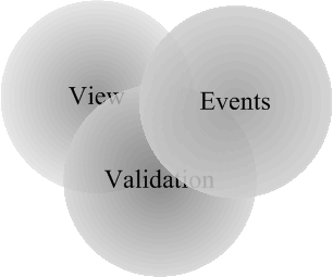
- View. View is like "face". View is used to reflect the component state and view allows a user to interact with the component.
- Validation. Validation is bound with different metrical parameters (preferred size, fonts, and so on). The parameters are used to render and layout the component. A GUI component can be shown if it has valid status.
- Events. Events are like "blood" that makes the GUI Component "alive". A GUI component can receive, handle and perform different events.
As rule the three notions depend on each other, the image above shows these dependences by intersection three notion-circles. The concept is simple, but it helps to understand library ideas correctly.
Lightweight component is a component that implements LwComponent interface. Draw attention that light weight component has no relations with java.awt.Component (like AWT or SWING components). So the lightweight component is "real" lightweight component that rejects any relationships with the "native" java.awt.Component. This approach helps to solve following problems:
- Hard coded view. It is impossible to inherit, for example, java.awt.TextField component to re-implement some functionality, because this is not lightweight component. Actually the component is a wrapper for a system GUI component and it is practically impossible to change its behavior.
- Slow painting and creating process. Try to use a large number of Java AWT components in a real project. An application will work and paint extremely slowly (actually, it is impossible to use big number of Java AWT components).
- The set of the Java AWT components is not enough for real applications development.
The SWING library is more powerful than Java AWT library, but it's very greedy to the system resources (have a look to the memory usage). Moreover, SWING components are based on AWT components (java.awt.Component). The big size of the library makes it useless for mobile devices and thin clients (the client has to download the whole package, or install special plug-in to his browser).
In addition, our library provides lightweight container interface - LwContainer. It's just like java.awt.Container, so you can start using our library easily. Before we'll go to the description of the lightweight component let's define basic lightweight determinations:
Det. 1: Validation - a lightweight component is valid if all metrical characteristics are defined and calculated. For example, if a text is changed for LwLabel component than it is necessary to recalculate size of the new text. The new size will be used to calculate preferred size of the component.
Det. 2: Transparency - a lightweight component is transparent if painting process doesn't use a background of the component. In this case the component uses a parent background.
Det. 3: Preferred size - this is size that a lightweight component "wants" to have plus the component insets. Preferred size depends on validation status, only a valid component can have correct preferred size.
Det. 4: Clip Area - this area where painting is possible. Rendering operations have no effect outside of the clipping area.
Det. 5: Insets - this right, left, top, bottom indents that determine clip area for painting process. If a component has size - (w, h), location - (x, y) and insets - (left, right, top, bottom) than it will have following clip area: (x + left, y + top, w - left - right, h - top - bottom).
Det. 6: Origin - this is a component view offset. Origin defines how the component view has to be offset relatively the component point zero-zero (basis of coordinate system). This is useful to organize scrolling.
Det. 7: Enablement - Enablement determines ability to receive, handle and perform events for a component. Only enabled component can be a member of event distribution process.
The table below shows basic properties of the lightweight component:
| Property name |
Methods |
Description |
| size |
Dimension getSize()
setSize(int, int) |
The property determines size of the component. If the component is a child of a container that layouts children according to preferred size than it is impossible to determine size of the component by the method setSize(int, int) (see chapter Lightweight container to understand the layout algorithm) |
| location |
Point getLocation()
setLocation(int, int) |
The property determines location of the component inside a container. The parent container can set the location for their children by a layout manager, so it may be impossible to set a location using the method setLocation(int,int) |
| preferred size |
Dimension getPreferredSize()
setPSSize(int, int) |
The property defines a preferred size of a component. There are two abilities to set a preferred size:
- 1. The preferred size is calculated according to metrical characteristics (LwComponent) or according to a layout manager implementation (LwContainer).
- 2. The preferred size can be fixed by setPSSize(int, int) method. If it is necessary to discard from the fixed preferred size, use "-1" value for appropriate argument (width or height) of the method.
|
| opaque |
boolean isOpaque()
setOpaque(boolean) |
If the property equals "false" the component is transparent. |
| visibility |
boolean isVisible()
setVisible(boolean) |
If the property is "true" the paint manager will render the component and a parent container will layout one. |
| enable |
boolean isEnabled()
setEnabled(boolean) |
If the property is "true" the component will participate in event distribution process. |
| validation |
boolean isValid()
validate() |
If the property is "true" the component is valid. To perform validation process use validate() method. A container component is responsible for validation status of its children components. |
| insets |
Insets getInsets()
setInsets(top, left, bottom, right) |
The property defines insets for a component. |
| origin |
Point getOrigin() |
The property defines an origin for a component. |
| background |
Color getBackground()
setBackground(Color) |
The property defines a background color that will be used to fill background of the component (if the component is not transparent) |
Lightweight container is a lightweight component that can have other components as children. The library provides the container interface - LwContainer and of course, has implementation of the interface - LwPanel that is ready to use. The usage of the lightweight container is similar to java.awt.Container usage, but there are two essential differences:
- A layout manager has to be always defined for the lightweight container. Java AWT allows not use a layout manager, but it works not good if you try to combine layout and non-layout ways in an AWT application. But it doesn't mean that it is impossible to layout lightweight components using specified by the setSize(int, int) and setLocation(int, int) methods sizes and locations. The library provides special layout manager for this purpose - LwRasterLayout. The set of layouts that is provided with the library is shown in the table below:
| Layout |
Short Description |
| LwBorderLayout |
This is analog of java.awt.BorderLayout. |
| LwGridLayout |
This is like a mix of java.awt.GridLayout and java.awt.GridBagLayout layouts |
| LwRasterLayout |
The layout manager uses location and size that have been set with setLocation(int, int) and setSize(int, int) methods. Actually this layout manager does nothing. |
| LwFlowLayout |
This is like a java.awt.LwFlowLayout but it has some additional features. |
| LwListLayout |
The layout is created for LwList component. |
The next difference is that lightweight layout managers are designed to layout Layoutable components inside LayoutContainer. It means that lightweight layout managers can be used for other components (even non-GUI components) that implement two interfaces (Layoutable and LayoutContainer), not only for lightweight components. At the same time Java AWT layout managers cannot be reused outside Java AWT Library.
Any lightweight component has a view. There are two ways to implement lightweight component view:
- Lightweight component provides two methods that can be overridden: paint(Graphics g) and update(Graphics g). First method is used to paint view of the component and the second method for updating the component area (background). It's not specific - it is the same Java AWT painting component algorithm.
- Lightweight component has view manager. The manager can be used to determine view for the component dynamically. The library provides set of ready views (border, image, text and so on) that can be used for the purpose (see the next chapter to understand the view management concept).
These two ways are demonstrated in the table below:
| Painting methods overriding |
View manager usage |
public class MyComponent
extends LwCanvas
{
    public update (Graphics g)
    {
       Dimension size = getSize();
       g.setColor(Color.red);
       g.fillRect(0, 0, size.width, size.height);
    }

    public paint (Graphics g)  {
        g.setColor(Color.black);
        g.drawString("This is my view", 20, 20);
    }
}
|
LwComponent c  = new LwCanvas ();
LwViewMan     m = c.getViewMan(true);
m.setBorder(new LwBorder(LwBorder.PLAIN));
m.setBg(new LwImgRenderer("myBg.gif"))  ;
m.setView(new LwTextRenderer("This is my view"));
|
Lightweight component provides repaint method. The method initiates repainting process. Lightweight component has no specific implementation for this method it just calls appropriate method of lightweight paint manager that knows how the components should be painted. Current implementation of the library paint manager supports following features:
- Double buffering. It means that lightweight components are painted using memory buffer and after that the memory buffer is painted on a visible surface. The feature allows avoid blinking and improves painting performance. However, double buffering can be toggled off with special method of the paint manager.
- Component transparency. Any lightweight component can be transparent. It means that the component has no background. In this case parent component background will be used as a child background.
- View manager support. View manager is special class that determines "face" of the component by a set of views. View is a class that provides painting rules. This feature allows implementing view for any lightweight component without any changes to the component functionality. To get more information about view management and creation see chapter Lightweight View Manager.
Lightweight paint manager implementation uses following algorithm to draw a component:
- Validates a component if it is necessary.
- Calls update(Graphics) method if the component is not transparent (a component is transparent if the method isOpaque returns "false"). If the component is transparent and has a view manager which defines a background view than the view will be used as the component background (in this case update(Graphics) method is not called), if the component has no background view than the background color will be used to fill the component area.
- If the component has a view manager than the paint manager paints a border view and a face view (if these views are determined).
- Calculates clip area. The clip area is calculated as intersection of the component size (minus the component insets) and current clip bounds.
- If the component determines own origin by Point getOrigin() method than the paint manager sets the new origin. Origin can be used if it is necessary to shift the component image (for example the feature is used to organize scrolling for LwTextField component).
- If the component has a view manager and the view manager determines a "face" view than paint manager draws the view.
- Calling paint(Graphics) method of the component
If the component has a child component (in this case the component is a container) than the paint manager computes clip area, transforms point of origin accordingly the child location and performs painting process for the child as described above. The process is repeated for every visible child component.
First of all let's define what the view is. Very often it is necessary to solve two tasks:
- Painting decorative elements. Practically every GUI component uses some decorative elements as a part of its "face". For example a checkbox component has toggle element, every components can have border or complex background (image). So, it is necessary to have ability to control the view (for example, if somebody wants to have other view for a checkbox toggle element). Java AWT library components have not ability to change view dynamically, as the Java AWT components views are hard-coded with paint(Graphics) method. In this case if you want to change a component view, it is necessary to inherit the component and override the paint(Graphics) method. The lightweight library provides special abstract class - LwView to implement own views. Views can be used as a part of "face" for a given lightweight component with a view manager of the component.
- This is very important to have ability to paint different objects (images, text and so on). The library provides special abstract class LwRender. This class inherits LwView class and this is a variation of a view that has been described above. The main difference of the render from the view is the render is bound with an object and it is used to paint the object. Actually, render is bound view.
The second question is views and renders usage. For this purpose lightweight component has a view manager. The manager provides ability to determine 3 view types:
- border view - the view will be used to paint a component border
- background view - the view will be used to paint a background (for example it is possible to use an image as a component background)
- face view - the view will be used as a face of the component (for example LwLabel component uses LwTextRender as the face view)
The library provides advance view manager that can be used to support dynamic view changing. The main feature is that manger can contain set of named views for a component face. The name of a view determines state of the component at the moment.
For example LwButton component uses advance manager to define two named views: "button.on" and "button.off". In this case, "button.on" name correspond to button pressed state and the button uses a view that is bound with the name, otherwise will use "button.off" view.
The last question is a view painting process. To define your own view it is necessary to inherit LwView or LwRender class and determine paint method for the class. The method is called with a paint manager. The paint manager passes graphics, location - where the view has to be drawn, size - that has to be used with the view and an instance of object - for which the view is painted. The view can be painted with three manners according to the view type:
- The view has ORIGINAL type. In this case, the paint manager passes preferred size of the view as the view size and insets.left, insets.top as a location.
- The view has STRETCH type. In this case, the paint manager passes size of an owner component for which the view is drawn, location is (0, 0). The type is used to stretch view image along owner component surface.
- The view has MOSAIC type. In this case, the paint manager passes preferred size of the view as the view size, but the view will be painted as many times as it can be placed inside the component area, the view location will be calculated for every time. The type is useful if it is necessary to define background pattern (for example using image pattern) for a component.
The table below shows views and renders that go within this library:
| View/Render |
Short Description |
| LwBorder |
The view provides set of different borders that can be used as border view for a component. The view is used to define a component border. It is not necessary to create own border view instances, because the library stores the border set as set of static objects instances that are available (use LwManager) by following keys: "border.etched", "border.raised", "border.sunken", "border.plain", "border.dot". |
| LwTitledBorder |
The view functionality bases on LwBorder view and it can be used to paint a border with a title area. |
| LwBoxView |
The view is a face of checkbox and radio box toggles. |
| LwImgRender |
The render is used to paint an image (target is java.awt.Image). |
| LwTextRender |
The render is used to paint a text (target is org.zaval.data.Text). |
| LwPasswordText |
The render is used to paint a password text (this class bases on LwTextRender). |
| LwAdvTextRender |
The render inherits LwTextRender to support block painting. |
| LwCompRender |
The render is used to paint a light weight component (target is org.zaval.lw.LwComponent). |
| LwWrappedText |
This render is used to paint wrapped text. The render brakes a text line if the line cannot be placed inside the drawable area as a whole. |
| LwBundleView |
This is bundle element view. It is used by scroll bar component to paint bundle. |
| LwCursorView |
This is text cursor view that is used by text field component. |
This is very important chapter. The library uses listener concept like Java AWT or SWING libraries. It means that if you want to handle an event than it is necessary to register appropriate event listener. The events and listeners are like Java AWT (see package org.zaval.lw.event.*) and there are no problems to understand it. But there are several key differences:
- First of all, lightweight component has no listener support. The lightweight component doesn't implement event distribution functionality and this is really good, because event distribution is concentrated in one place - event manager. This way has one more advantage: it decreases memory usage because lightweight component doesn't contain list of listener (listeners support). It's very simple: if you want to catch events inside your lightweight component, it is necessary to implement appropriate listener interface and event manager will immediately send events to the component. For example, to catch mouse events inside your component, you should implements LwMouseListener. As it was described above, a lightweight component doesn't provide listeners support for mouse, key, component, container, focus and so on events unlike a Java AWT component. But it is possible to handle all these tasks using LwEventManager, by registering appropriate listener - your listener will get appropriate events for all components, so if you want to listen the events for certain lightweight component you should test sources of the events.
- The lightweight library provides mechanism to control input child events. The input event is an event that is initiated by mouse, keyboard or any other input device. This is very important to have this feature for creating composite components. Composite component is a component that consists of several components that have to work together. For example LwButton is a composite component. The button component can have other components (including any other composite component) as a child. The problem, in this case, is following: if a mouse button has been clicked over any child component, the button mouse listener will not get the mouse event and so cannot handle it. There are two ways to resolve the problem:
- Register mouse listener for any button child component using the event manager listener support. It allows children mouse event listening and handling inside the button. This solution is like Java AWT (but in this case it is necessary to test if the event source of the event is the child of the composite component), but this way doesn't solve the problem if you want to use other composite component as a child (in this case you cannot control such child component).
- Another way is provided with the lightweight library, Java AWT hasn't anything like that. The main idea is that parent component can control input events distributing process for child components. In this case the parent component should implement LwComposite interface and at the moment the event manager will "ask" the composite component if the child component input events should be caught by the parent or not. If the composite component says that he wants catch child input events, lightweight event manager distributes the event as if the child component doesn't exist. The child becomes "transparent" for input events. The image bellow illustrates the composite components mechanism (for more info see chapter Creating composite component in "Teaching materials"):
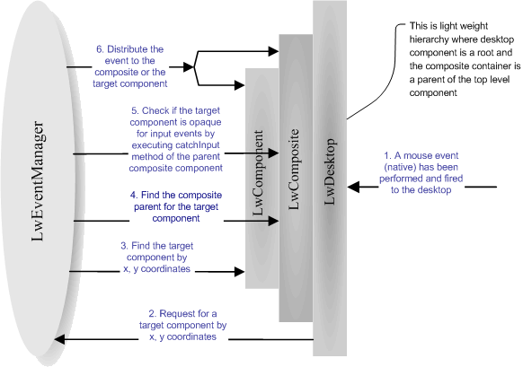
- First, the LwDesktop (this is lightweight top-level container for all other lightweight components) gets native input event (mouse event) and converts this event to appropriate lightweight event.
- LwDesktop asks the LwEventManager what lightweight component is a source of the event based on its location.
- LwEventManager defines the source according to the location.
- LwEventManager tries to find if the source component has a composite parent component.
- If the parent composite component is exist than LwEventManager asks it (by executing catchInput method) whether the child input event should be caught by the composite component or not.
- LwEventManager distributes the input event to the composite component or the child component depending on the previous step.
The algorithm is recursive, so it will work fine if there are several composite components in a hierarchy.
Validation is also important part of lightweight component lifecycle. In compliance with validation notion only valid component can be laid out and painted. The main purpose of the validation process is to calculate the component metrics. The metrics define a preferred size and the preferred size is used to layout the component inside with a layout manager of a parent container. The library provides two types of lightweight components and accordingly two ways to calculate component metrics:
- LwComponent (LwCanvas), LwView, LwRender. These interfaces determine simple lightweight component and views. In this case validation process calls recalc() method to compute component and view metrics. To perform a validation process you should not call the method directly, it is necessary to call validate() method of the lightweight component or view and after that, if the component is not valid recalc() method is called. It means that recalc() method will be executed only if it is really necessary to do. It allows avoid redundant calculation of the component metrics.
- LwContainer (LwPanel), LwViewMan. These interfaces and classes determine components and views containers. The main difference is that a container metrics are defined by children components, so you should not override recalc() method and perform any metrics calculation. Draw attention that a container component is responsible for children validation. It means, if a validation process is performed for a container with validate() method than the validation process will cover every child component.
The library has special type of objects - static. Static object is a class whose instance can be used safely with several other classes. For example, lightweight component view manager has method to define a border view, but there are only several types of borders and it is not necessary to create the same border view instances for different components. In this case, we can have set of border view instances and use one border view instance for several lightweight components according to the border type. The static object concept is used to decrease system resource usage.
Let's define the notion of the static object: what class can be used as a static? It is evidently, that static class instance should not allow any properties changes, because the same instance is shared between other classes. The static object for the lightweight library has to comply with following:
- Any properties changes for static object instance are not allowed. All properties should be defined during construction of the instance.
- To use the static object instance it is necessary to describe the static object in lightweight properties file (static object section). And only after that the instance will be available for LwManager class.
- It is possible to use integer, string and boolean argument types for static object constructor input, so only these types can be used for static object constructors.
- The library identifies an instance of the static object by the instance key (to get the instance it is necessary to know the key). There are two ways to determine the instance key. The first way supposes to define the key by appropriate section of the lightweight properties file and the second way supposes that instance defines the key itself by implementation org.zaval.util.Keyable interface.
Actually, there are two ways to organize scrolling for a GUI component:
- By changing the component location inside the component container.
- By moving a view of the component.
This library supports both ways. The basic rules that you should use to implement component scrolling are shown below:
- Use org.zaval.misc.ScrollObj interface to provide appropriate scrolling mechanism, the interface will be used with the scroll panel (LwScrollPan) to scroll the component.
- Use getOrigin if it is necessary to move a view for the component. The method tells the library (actually, paint manager) how the component view should be moved relatively to the parent component origin.
- Use getLayoutOffset() method if it is necessary to scroll child components inside the container. This method tells layout manager how the child components should be moved.
This chapter describes lightweight application components. By "lightweight application" we mean java applet and standalone applications. Any light-weight application consists of two parts:
- Desktop. The term means top level container that is parent for all other lightweight components. As rule the container is used to reside all other components of a lightweight application. The implementation of the Desktop is represented with LwDesktop class.
- Windows. Desktop provides ability to open, close, activate window components. It is possible to use any lightweight component as the window. For example, combobox component shows popup pad as the lightweight window. Moreover the library provides LwWindow component that is much like "classical" window. Draw attention that any desktop window cannot be rendered outside the desktop area, that is this is like Java SWING internal frames implementation.
The next question is how to create a light weight application. To create a standalone application you can use LwFrame class. This is not a light-weight component, actually this is an extension of java.awt.Frame class where the desktop is resided. To get the desktop uses LwFrame.getRoot() method. The sample bellow illustrates this class usage:
LwFrame frame = new LwFrame();
frame.setSize(400, 400);
LwContainer root = frame.getRoot();
root.add(new LwButton("Button 1"));
frame.setVisible (true);
The library doesn't have something like LwFrame for creating lightweight applet, but anywhere it very easy, see the sample bellow:
public class MyApplet
extends java.applet.Applet
{
public void init ()
{
super.init();
setLayout(new BorderLayout());
LwDesktop desktop = new LwDesktop();
add(BorderLayout.CENTER, desktop);
desktop.add (new LwButton("Button 1"));
}
}
All support for software installation and problems should be sent directly
to support@zaval.org with 'Re: Zaval LwVCL Support' in subject line and plain text in the
message body, describing your request and/or your problem. Since this
software is distributed under the General Public License and is maintained
by its authors on non-commercial basis, your request will be answered
as soon as possible, but no later than 5 business days.
The Zaval Creative Engineering Group carries out its software customization/new software development on the regular basis. For more info contact us at info@zaval.org.
Now you can receive information on latest products' updates and hotfixes via email.
This is a low-traffic list (1-2 messages per month). To subscribe, send blank mail to news-subscribe@zaval.org.
For more information about the product, please contact Zaval
CE Group directly in a free form.
Thank you,
The Zaval CE Group.
|


